Deflating stagnation arguments
"Wages haven't risen since 1970" is a myth
Many American politicians and voters on the left and right have adopted an economic narrative about neoliberalism and capitalism that irks me. The story goes something like this: “Americans enjoyed steady wage gains and upward mobility in the postwar economy until the neoliberals took over in the 1970s, and their policies of privatization, deregulation, immigration, tax cuts for the rich, and free trade created massive inequality and wage stagnation.” There are far too many parts of this narrative that are wrong to address in one post, so many of my articles coming up will be a series of arguments explaining why (i) there wasn’t nearly the stagnation that histrionic politicians purport, (ii) America’s policies weren’t as neoliberal as critics state, and (iii) why we need more ‘neoliberalism’ to solve the very real problems we face, not less. For the first article, I think it is important to briefly explain why the narrative of wage stagnation is overhyped and incorrect.
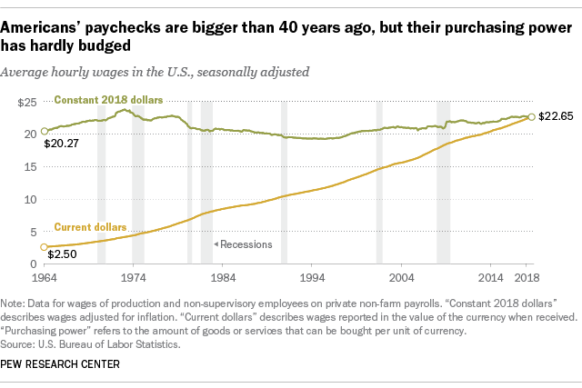
The above graph is one example of a wage stagnation graph that doesn’t capture the full picture. I’ll explain why.
Wage stagnation is a pervasive slogan and concept among both the progressive left and the national conservative right. It is used to decry ‘neoliberalism’ and it is a supposed smoking gun for all the problems with capitalism, corporatism, immigrants, free trade, the Chinese, or insert any other thing you don’t like.
This is the kind of graph that gets thrown around a lot. Supposedly, there was some sort of “great decoupling” between productivity numbers and wages. And yet, it really is an illusion.
As pointed out in a paper by Martin Feldstein, the deflators used in the graph (the metric that adjusts for inflation) are different for the productivity number and the wage number.
The […] problem is the way in which nominal output and nominal compensation are converted to real values before making the comparison. Although any consistent deflation of the two series of nominal values will show similar movements of productivity and compensation, it is misleading in this context to use two different deflators, one for measuring productivity and the other for measuring real compensation.
Feldstein points out that while the deflator for the business sector between 1970 and 2006 averaged 3.8%, the Consumer Price Index averaged 4.3%, meaning that the wage numbers were getting downwardly adjusted for inflation more than the productivity numbers. This is because productivity numbers usually use the business sector deflator while wages use the CPI as a deflator:
The average rise in real productivity was 2.9 percent while the average rise in real compensation as conventionally measured using the consumer price index averaged just 1.7 percent. This difference of 1.2 percentage points is however very misleading because of the use of the consumer price index. If we instead compare the average rise in nominal productivity (5.4 percent from 2000 through the third quarter of 2007) with the average increase in nominal compensation (5.0 percent), the gap is reduced to 0.4 percent. In real terms, productivity rose 2.9 percent while the corresponding measure of compensation rose 2.5 percent.
Additionally, “wages” aren’t even a fully correct measure. While wages are important, total compensation is the more accurate number. Feldstein points out that between 1970 and 2006 the share of compensation that came in the form of wages fell from 89% to 80%, meaning non-wage compensation increased. In other words, it cost companies more to provide health coverage for their employees as health care has become more expensive. This is still a problem because it eats into workers actual take home pay, but it’s an indictment of the healthcare system, not of wage growth.
Feldstein covers more of these points in detail and I’d recommend reading it because it’s an easy read for most that avoids jargon and complicated equations.
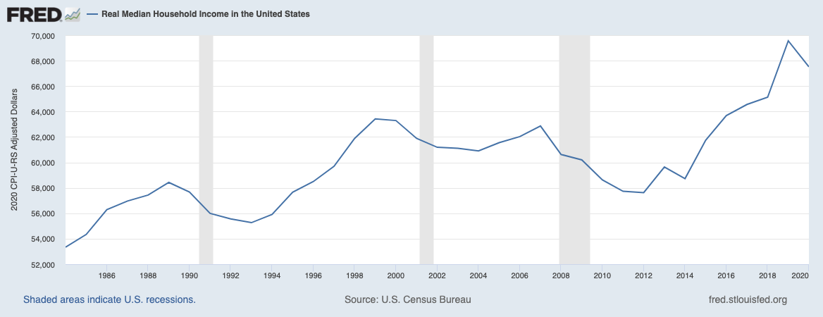
A quick search on St Louis Fred shows that real hourly compensation has increased by quite a lot since the year 1970, by about 50% in fact! This is a far more accurate picture than the graph from Pew that shows no wage gains in 40 years. Some skeptics might pull up the figure that median household income has not risen by nearly as much:
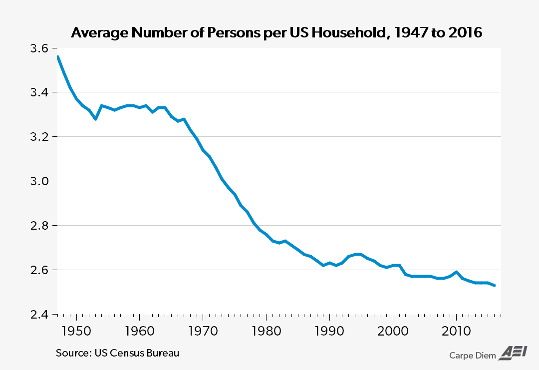
This looks like an increase of about 20-25%, a more modest increase than the hourly compensation figures would suggest. This might even imply a degree of stagnation for America’s families. But what many don’t realize is that the measure of households is misleading. As divorce has increased, the number of households has also increased, meaning that while incomes have risen, they’ve been divided into smaller and smaller households, statistically shrinking the real wage gains.
I first learned about this while reading Thomas Sowell’s Basic Economics, and it’s a truly striking point to think about. The number of households has grown, dividing the income gains among more households with fewer people in them. If we take a look at median personal income, we see, again, that the wage gains seem to be about 50%.
So it is clear there have been some strong wage gains for the vast majority of Americans over the last 40 years, and the claims of stagnation are just wrong. Additionally, the CPI that is adjusting many of these compensation graphs for inflation is known to overstate the effect inflation has on people’s living standards. For example, the benefits of the internet and wikipedia are not picked up in the data, yet they clearly have some positive benefit, albeit small. Globalization has allowed us to get a greater range of products from a greater variety of places, something that itself isn’t exactly picked up by the CPI.
The next time someone tries to convince you wages have decoupled from productivity, looking to the deflators can quickly deflate their argument.


